
1. Design a mobile app that allows people to browse travel information, share insights, and meet up.
2. Develop a solid branding to promote new website and gain new users.

Travel solo can be free and flexible while people also pay price for it. How can Wander minimize the downside of traveling alone?
The situation and needs could be very different when people is by themselves and with groups. To start, I carried out a research plan to help me get insights of solo travel and solo travelers.
I looked into data that of travel history and trends in the past and during the pandemic. The full research plan and results can be found here.
The market research helped me:
Without knowing specific needs from solo travelers but with the assumption that most solo travelers currently are using popular travel products to help their travels, I researched top 3 travel APP that travelers trust and get information and a social APP which aims to connect travelers. I analyzed how they addressed user needs and what their weakness are to give a big picture of travel product design.

Key takeaways are:
Then I conducted user interviews with 4 people who likes to solo travel/ have solo travel experience to uncover their travel behaviors and preferences. Participants are aged 24-35. Three are single, one is married.
Key notes from interviews are:
Then I used empathy map to have a deeper dive of users to be more precisely define their needs and pains.

Interviewees are motivated by blogs and stories and checking them out is the way for them to find their next destinations.
People expressed strong interests to know culture through locals while solo traveling and they think it is a great opportunity when they are not bounded by other people.


This is the point made by almost every interviewee. They wanted to enjoy the freedom but are also frustrated with being alone for the entire trip. Finding the balance is what they are looking for.
With the information I learned from the empathize, I created a persona for the project to guide me in the following steps. The target users will be extrovert, social, and like exploring and sharing.

Since this is a fictional project, the business goals were being developed with the research process and better understanding of the projects and problem spaces. Building upon with previous steps, I created three project goals to stay focus on travel community, localized experiences, and sharing. The full version is here.
With three goals defined. I started brainstorming ideas that would help achieving them. This process help me throw out any idea to make the business possible and goals achievable. I came up with a list of ideas of what to do to help business and users to achieve their goals. However, a number of them require strong technical, financial, and user base support. It is impossible for a new business with the consideration of limited resources and budget. Therefore, defining the unique challenge and creating priorities is critical as a start. so -
I revisited persona and goals to define the uniqueness of the project. I also did second round of market research to identify the current market gaps and how the project could fill the gap with the unique challenge.
By looking at the persona and consider the technical difficulty, the unique challenge to the project I concluded was connect users and provide more local experience.
There are a number of travel agencies/companies providing services for solo travelers while the majority of programs are group and service based such as group touring and group activities (what Airbnb is offering). Providing platforms for voluntary connections between travelers and local experts is a big gap in the current market. Tripadvisor has built community while the main purpose is for sharing. The travel community in Booking.com and Airbnb is only created for Q&A. Meetingup with local people and travelers has a big potential in travel market, especially solo traveling market. I have looked into a few businesses who has been working on this model and learned their strengths and weaknesses
.jpg)
Without a big user base as support, connecting users in small cities is very challenging and will lower the quality of services. To start with, I researched popular destinations in the past decades and evaluated their potential in providing localized experience and convenience for solo travelers. Below are the criteria and cities I selected for the APP launch.

By defining the challenges and focus, I created feature roadmap based on the priorities. This helped me organize and develop the application map.
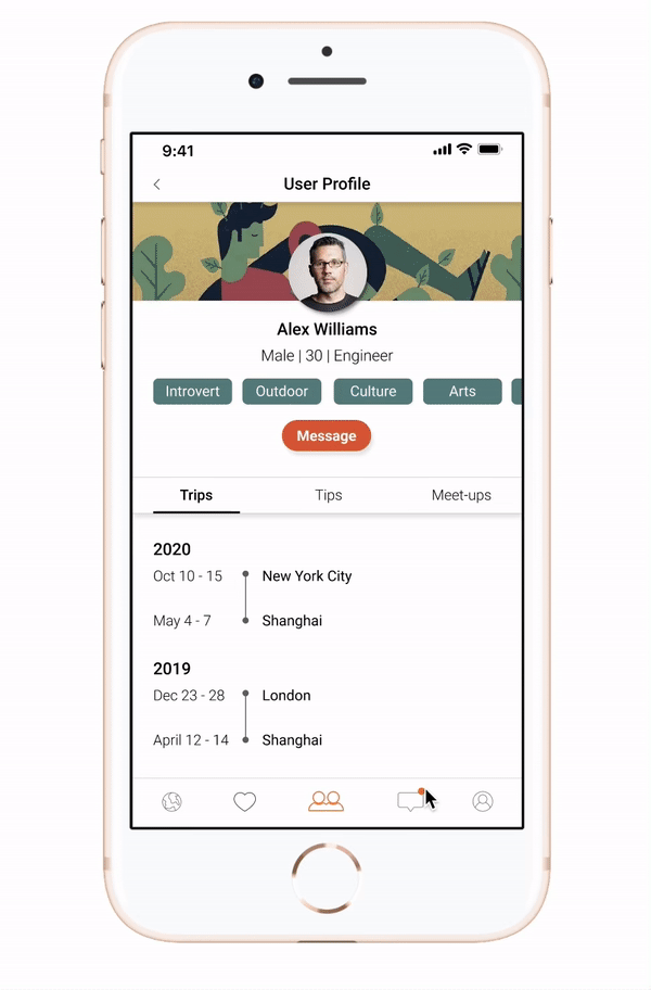
The application map was essentially constructed with three major flows: experience, socialization, and personalization. The explore and saved is where users to find travel information and insights and save destinations for quicker access. The meet-up and inbox is where users to connect and communicate with travelers and locals. The account is for user information, preferences, and looking for any assistance.

I used two scenarios to help me construct the flows of people how to interact with the APP to complete the tasks.
.png)
With the stack-up from the previous work, I created UI requirements for screens that are important for the flows and started with some initial sketches to help me envision the screens.

Building upon with the sketches, the mid-fidelity smoothened flows in details such as global search, profile list, and story tab structure.

To make sure users can interact with the APP obstacle-free. The usability test was conducted with 4 participants whose experience with using mobile varies from limited to excessive. Tasks were created for three critical flows:
I used affinity map to organize observed issues. There was no big issue observed during the testing. The common issues fell into three areas:
After revisiting the design and locate the problem areas, I came up with solutions to improve the design.
Problem: 3/4 participants got confused by stories and reviews.
Solution: Change stories to tips and added goal to the tab to help clarify.

Problem: 2/4 participants are not clear about where to find accepted requests.
Solution: Added notes of how users will get notified in “request sent” screen.

Problem: 4/4 participants are having difficulty sign themselves up for meet-ups in a destination.
Solution: Changed the word from “I want to meet-up” to “Sign up for meet-ups” and added CTA in meet-up main screen.

As one of the two challenges, coming up with a solid branding is also critical for the success of the APP. By reviewing the target users and goals, the branding of Wander should be:
The design strategy is to select colors that could speak for localized experience and interaction. The imagery selection is leaning towards cartoony because the target user are between 20-35.

Color Strategies
Color Strategies


Travel is a thing that the majority people celebrate and it is easy to make assumptions from personal experience. Digging out the unique needs for solo travel took significant efforts and gave me lots of hard times. What I learned the most from project is to stand with the business and deal with the facts by coming up the priority plans. I am really proud of the solutions I took to identify the priorities. They make the project more real and implementable.