

Pin key items and get quick access to them
Users can pin key items on the home page for a quicker access. The pins can be replaced and deleted as needed.
Connect with key features
Users can get to key features including pregame, tasks, recordings through the home page. Both built-in view and full view are available.


Clear information hierarchy
No overwhelming information and call to actions on the home page. User can check more by going to corresponding pages through the home page.
Problem 1:
Low Engagement with the current home page
Problem 2:
No “hub” that links key features and increase interactions
Problem 3:
Pickle users need something that accelerates the productivities.

“We don’t need an overview page, we need a home page that helps improve teamwork and personal production”
Users were asked questions about the app in general with some targeted questions about essential features. Some insights distilled from the interviews are:
What is the core value of the home page?
In the initial strategy meeting, the whole team talked about the goals and core value of the home page. The CEO emphasized that we don't want just a summary page that has nice data visualizations for users to review. We want to make sure that features in the home page are actionable and can provide insights.
The other big part of the home page is to create connections and increase interactions with the existing features. Pickle has been focusing on developing other core features in the past two years. It is the time to design a feature that unites them and show the core value of the business to users when they land on the APP.
Understand the current major interactions
To better define the connections with major features, I illustrated user journey of major interactions with the current application for two personas - account executive and vice president.

The key interaction for AE is to prepare for a meeting and follow up on a meeting. The major interaction with the application is pregame and review the meeting recording.

The key interaction for VP is to track deals and conduct team training. The major interaction with the application is review snapshots and meeting recordings.

The workshop was conducted among the design lead, user researcher, and myself.
The major discussion is around how to create to help access to key content and increase team collaboration.
The key ideas came out of the workshop were: content pin, team notice, and meetings

The solutions for increasing collaboration are concentrated on information sharing and team activities reminder. Below are the features the team created.

The solutions for the access to the important information are highly focused on providing users with quick access to key elements on site, which include:
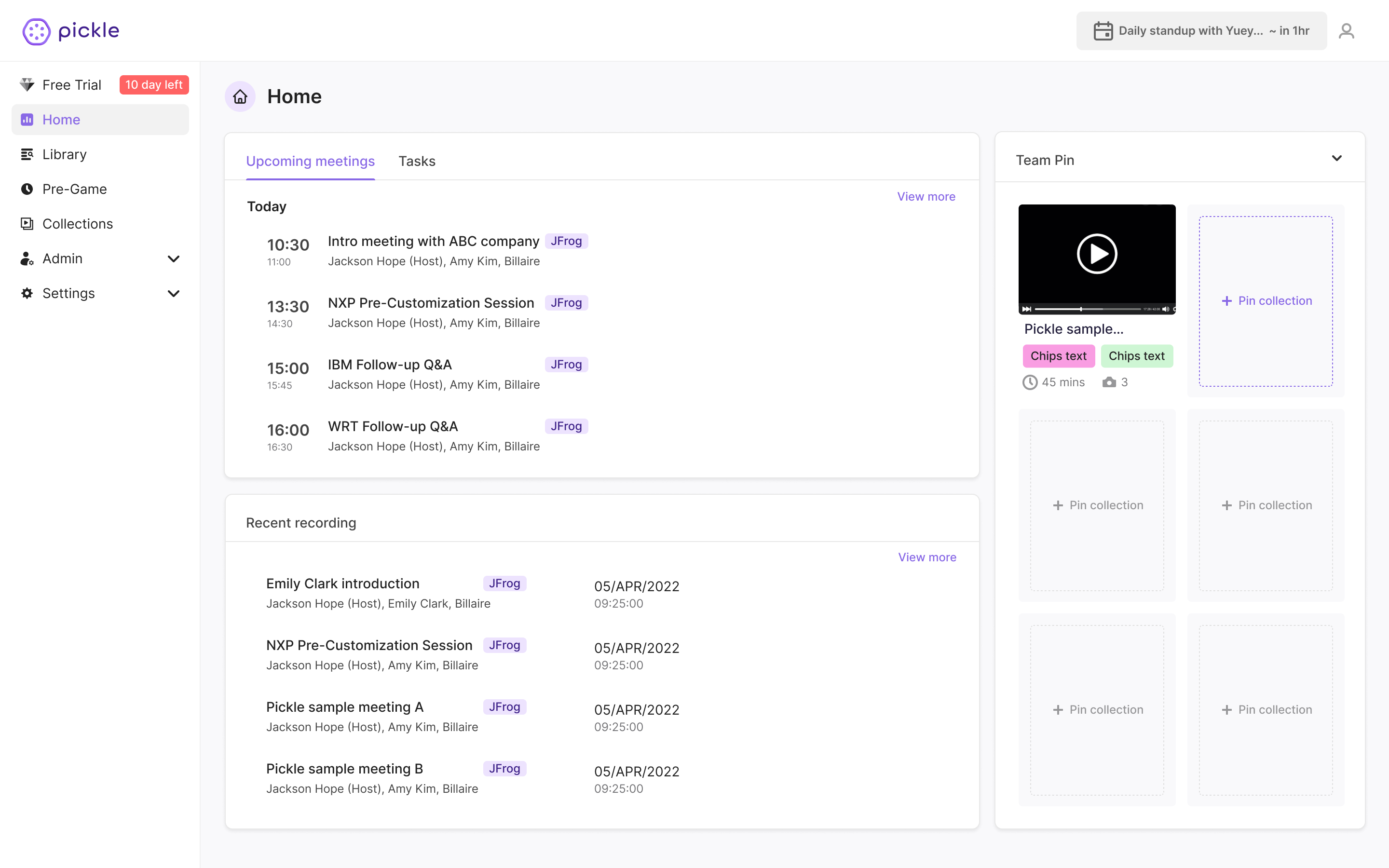
MVP - Introducing "PIN"
Pin is a feature that allows users to set critical information to show on the home page. The pin feature would get the contents that are useful and helps team work to to show on the landing page of the Pickle APP, so that users can be informed and access to them quickly when landing. This could largely increase the interaction with other features and increase the work efficiency.
The team has a big discussion around the contents that can be pinned. Currently there are two types of contents in Pickle APP - recordings and snapshots (highlighted parts of recordings). These contents can also be selected and collected in a collection for better organizations and management.
To start with and to avoid confusion, the team decided that only a collection can be pinned in the first phase.
The pin can be added in a collection with the pin icon.
Having personal pin and team pin is ideal. However, the team wants to start with one version to test out rather than putting in significant efforts in developing both.
Concept A&B
There are some debates around the priorities and design patterns among the team members. The team wanted to be more effective in the home page development and brings the real value to the users.
Ideas and Layouts
The biggest thing the team wanted to test out is that whether the core value of the home page is the team collaboration or the personal access. The team create two design layouts for each idea.

Design Patterns
The team also wants to use this A/B testing to The different design patterns are used for "personal work flow" content (upcoming meetings, tasks, and recordings). The concept A used card format for each feature. The concept B used drop downs in one card for all these features.


Testing through Maze
The user researcher developed a testing plan and the user interviews were conducted on both Maze and among the internal team. The selected candidates did the testing of the design with and without guidance. Below is the heat map from Maze usability testing. The dark the area, the more traffic.

.jpg)
Result - no pattern identified
The preference on the concepts is pretty equal. There is no one that is more preferred over the other. The barriers we observed and the comments we received are mainly focused on the areas below:
Concept C?
The design patterns in both concepts had some barriers identified in the usability testing. In this version. The design team tries to finds a solution that would dismiss the barriers and pauses in the previous version.
Users expressed concerns for not able to see more information in concept and feeling too overwhelmed when they see too much information. To find a middle place, the design team decided to:
The team was also developing the notification feature while designing the home page. The features have significant overlaps and the team decided to integrate the team activities into the notification feature and leave the team board as recent activities and stays at the personal level.

The second usability testing was conducted among stakeholders. There was no barrier identified in the testing only some comments on potential improvement in design version 2.
The majority of the stakeholders don't see the value of having activity in increasing interactions and subscriptions, at least at this phase.
The big discussion is around how to manage the pins. The current design only allow users to add four pins and once four pins are added, the new pins will automatically replace the oldest one. However, the stakeholders thinks this would discourage people using the pins if they can't freely pin what they want. All agreed to spend more time on improving the design and developing features that are needed to allow this happened.
The stakeholders liked using tab as the design pattern to make information more consolidated and the home page cleaner. However, the downside of it is that users can not see the full content at one time. So showing critical information at the first glance will keep more users to be on the home page.
In design V3. I removed the activity part the replaced it with team pin. The home page contents are pretty much centered around the daily work flow (meetings, recordings, and tasks) and pins.
To make the home page less busy. I moved CTAs of each line item to its hover status. the CTA can only be viewed when users hover on the line items.

With the replacement of the activity, I also redesigned the team pin to allow users to take actions from the home to add or replace pins instead of going to the collections to do it.

"We don't need a just normal page design" is the most hard part. This project helped me learn how to connect their needs to the key features already exited while understanding users needs. The design layout and pattern exploration and see how users react is also a good learning session for me.