

We need a dashboard to get more insights of the meeting and improve team performance.
Low engagement
The current engagement with the dashboard is low.
No Insights
The dashboard doesn't provide enough insights.
Poor Data visual
The data visualization is not appealing enough.
Not intuitive
The data presented are not intuitive for a quick understanding.
As a starting point, the user researcher walked us through the persona and user journey map created earlier and highlighted the differences between two persons and their needs and goals.

Account Executives are sales people who face customers at their daily work. Their work focuses on getting more customers and getting deals close.
Vice presidents don't do much customer facing work. Their work is focusing on team management and revenue boost.
I worked on summarizing user needs and goals by consolidating two persona and tailor them specifically to the dashboard design.

With user goals created, we combined with business goals to come up with the project goals to guide in the next steps and throughout the entire design process.
The workshop structured with three parts - define HMW, discuss priorities, and explore preliminary solutions. Four key questions we come up from user research and use as guide for solutions are:
Brainstorm!

With the questions created, the step 3 is to brainstorm any possible solutions. Each individual brainstormed their ideas and voted for the good ones. The main ones came out from brainstorm are:
Solutions
Tasks
Recordings
Personal Performance
Team Overview
Individual Performance
Deals and Revenues
Preliminary Concept
Consolidate the tabs
Information Clarification
Deals and Revenues


Challenges and Considerations
With the first version of design created, the team shared with CEO. It is also the time Pickle is working on the integration of Salesforce and improving the training of artificial intelligence. some technical questions are critical to be considered in the next phase:

Concept Design - A&B
Me and the other designer worked on the first version of design together. However, we did have different thoughts and ideas that the CEO and design lead were excited about and wanted to test out what worked out better. Therefore, after the first stakeholder meeting, me and the designer were asked to work individually on two concepts.
Concept Design - A and B
A
Concept A is primarily on individual dashboard and emphasize on team collaboration and meeting performance.
B
Concept B is more on the team dashboard that helps team management and deal track.
Concept A
The key feature created for team coordination was the team notice that allows users to post important information and notice.

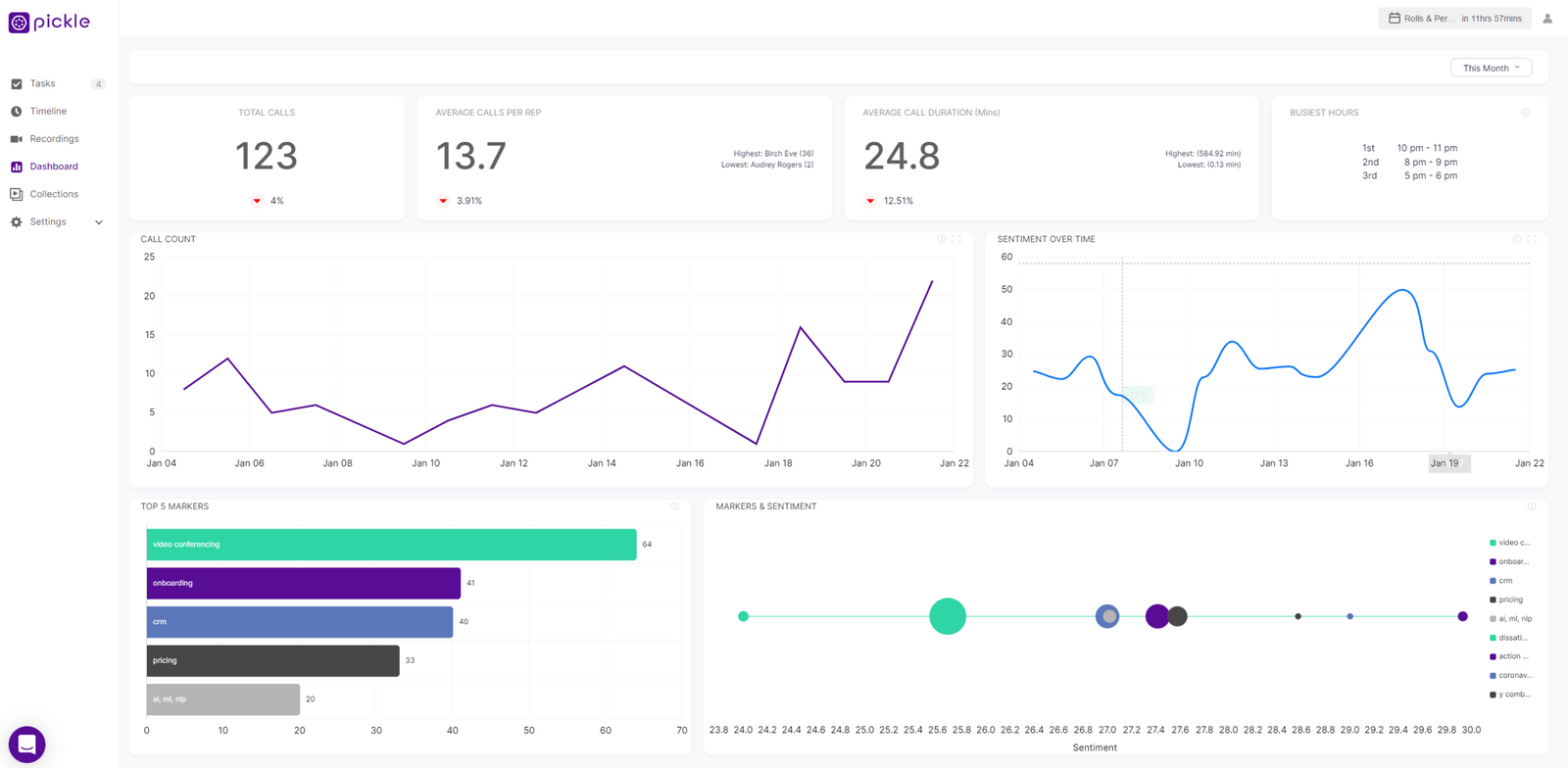
The design provides data summary for all recent recordings for users to check by clicking the "detail". Comparing to Concept B, this one has less visual for the data and aims to provide more overview.

Concept B
The deal track provides meeting details for top deals through a graph. The graph also links to the snapshots of markers mentioned for managers to review member's performance.

The team management was achieved through providing more details on individual's performance - rather than only providing data, the design links back to the snapshots for markers (topics) mentioned during the meeting.

Plans and goals
We worked with the user researcher on the research plan - including focus areas and follow up questions. She conducted usability test with four members of Pickle's sale's team (Pickle's primary users). the goals for the testing are:
Key Comments

"I like the summary but what can I do with it"
Users are pleased with the data provided but don't know how to take it from there. They need more actionable details in general.

"How to increase the engagement with the existing features"
Users are interested in seeing more interactive dashboard instead of solely data presentation.

"Great amount of information but is it too overwhelmed"
Users expressed the concern that they won't spend that amount of time on the dashboard daily. The information needs to be more concise and helpful.
Review and challenges
We had a second meeting with the CEO to discuss prioritized revisions for the second version of design. the key challenges are:

Design Improvement Strategy
The focus of the revisions is to make the design more interactive and concise.
Information hierarchy
Provide insights
Increase interactions
Create effiective comparisons
Design Improvements
The strategy was to present key information on one page by overlaying information such as sentiment and markers mentioned (positive or not) and leave out some summaries that cannot be analyzed or captured by the current artificial intelligence.

Rather than using tabs, we choose to present an overview by overlaying all key information and leave details in the second and third layer.

In the last version, the comparison was tracking each member's own performance month by month. However, it doesn't provide enough information for managers to identify who "needs help". In version 2, the comparison matrix was based off the average of team's performance and presented through a heat map so it's both visual friendly and effective.

One big comment that users had during the testing was that the design has limited interaction. In version 2, we used tooltip and connection with snapshots to provide more interactions.

Collaboration wise, this is my first task with Pickle and I had to work collaboratively with another designer. Ensure smooth connections and consistency between two is a big challenge. But we worked out well by meeting effectively with each other and the team. Design wise, how to provide appropriate amount of information with nice visualization is a big challenge. We explored different visualization from both competitors and tools such as PowerBI to ensure that the data is well presented and easy to be implemented.